A self-initiated design study focused on refining the University of Tennessee’s visual identity. This project involved “reimagining” specific elements of the brand that have stood out since the 2015 Nike rebrand, aiming to enhance the balance and legacy of the iconic “Power T” and its supporting typography.
Software Used
|
Identity Audit
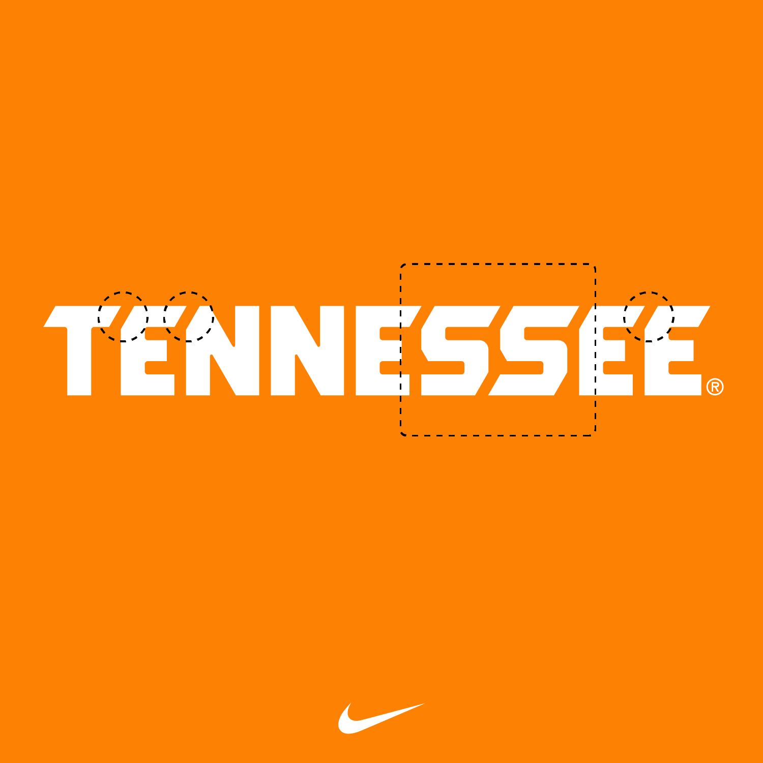
I analyzed the primary identity and wordmarks to identify areas for improvement in the 2015 Nike-unveiled system.
Systematic Refresh: I volunteered my services to refine the “before and after” experience of the logo. This involved a deep dive into the letterforms to ensure the typography worked in perfect support of the primary Power T identity.
Technical Refinement: I focused on the “nuances” of the type, cleaning up specific intersections and curves to create a more cohesive visual language across the university’s various platforms.
Volunteer spirit
A professional “reimagining” of a major collegiate brand. This study demonstrates a high level of brand-thinking and a commitment to design excellence, showing how subtle technical adjustments can elevate a powerful, existing identity to a more refined “Gold Standard”.